It seems like a lot of pressure and very baffling, doesn’t it?
What to put in the logo you’re developing? What colors to use? Should you create a logotype? Or a logomark? Or an ident? Or a full logo?

And what are all these terms anyway?
Hold on! And take a deep breath.
Understand some basics first so you know what you’re doing and you can feel empowered to take the right decision about your logo. Whether you’re developing it yourself, or having it developed by another professional, it is important to build confidence about this valuable asset you are building for your business. So let’s start to get it right.
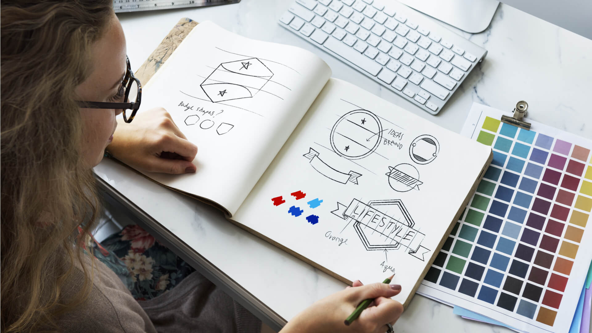
Great logos are memorable. They have been compared to the beating heart of your business identity. And they don’t get created easily.
Logotype or Logomark?
All logos are either logotypes, logomarks or a combination of the two. A logotype means the logo is based on letters, words or initials. A logomark is based on a symbol, icon or image.
Many companies and brands use a mix of the two. Images as well as letters. It might even be that the letters form an image or clever positioning of images forms a word.
What you choose to go with is entirely up to you. There is no rule to follow; though it is known that being able to say out a logo brings recall to the brand name.
If the name of your company or brand is long and complex, consider adding initials to a logomark if you want to make it possible to say it out.
How does it look in black and white?
You might love colors and maybe you have a clear idea of the colors you would like to put in your logo. Do also take a look at how your logo looks in Black and White as well. This is because there will be plenty of instances when your logo will be used without color. Perhaps a printout? Or maybe a cheaper grayscale advertisement vs a pricier full colored one? Whatever the case, check what your logo looks like in Black and White; your logo should look equally impressive in both cases. The personality of your logo is more important than its color.
Is it scalable?
Keep your logo design versatile and scalable. After all, you will be using your logo in a wide range of physical and online spaces. Having a scalable logo means it will not lose its sense of proportion when it is used in big or small spaces. Consider it on billboards, letterheads, your business cards, or packaging you use.
Include your business name or brand name if you choose, and avoid using taglines or unnecessary text in your logo. This is because if the logo is scaled down to be used in a smaller space, the text will become completely illegible. Stick to a clear, simple and preferably minimalistic design even if your logo is a combination of a logotype and logomark.
How does it look across all platforms you use?

Test it!
Where do you engage with your audience? Show off your logo online in all the social media and other online channels you use. For starters, it should be on your website and any app you are on. And if you have company accounts on Facebook, Twitter, Instagram, Pinterest, or others, then display it there too. Certainly use it if you are using digital or paid advertising. In short, your logo should be woven into your digital presence everywhere. That is how you will build recall with your audience.
So before you finalise your logo, ensure you have tested it across all your digital platforms. Don’t leave this to chance. Your logo should make an equally great impression everywhere it is seen.
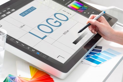
Consider the psychology of color for your logo design
Do you know you can take advantage of the psychology of color to maximise the impact of your logo design?
Different colors affect the viewer differently. Color impacts behaviour and emotions in the human mind. For instance, the color red is active and intense. It can be used to even create a sense of alarm if needed. Yellow evokes a sense of being happy, fresh and energetic. Blue gives out a sense of confidence, calm and reliability.
So research a little more on the impact of the color you are leaning towards before you pick a final one. Ensure the color you choose is different from that of your competitors since color is known to increase brand recognition by 80%. You wouldn’t want your logo to be confused with that of your competitor’s, would you?
Do fonts matter?
Yes they do!
Just like colors, fonts also inspire and convey different emotions. Naturally, different fonts work well for different businesses or brands.
Font weight, width, height, corner rounding, contrast, and overall geometry of the font are all like secret agents that work for the visual communication of your logo.
A bold and clean font which is more straightforward will convey honorability and strength, while a dynamic font might convey whimsical fun and sweetness
The overall logo you develop will provide an immediate idea of what your company is all about.
The shape, color and type represents the personality for your brand and should be consistent with the style identity you build in the mind of your customer.
Your logo communicates your company’s personality!