
Once you have been able to drive traffic towards your e-commerce store (through SEO optimisation or social media links or even through organic searches), you will want visitors to explore and engage with your web-store and ideally complete a transaction.

But just like no -one likes to enter a crowded and disorganised physical store where it’s hard to find items and shopping gives no pleasure, it is much the same with online stores too.
Shoppers are impatient and spoilt for choice. While visiting the web-store, no one has the time to search for long and go around in circles because he is not able to find the product/ information that he set out looking for. It is much easier and convenient for him to leave the website that is difficult to figure out, and check out the next one that catches his eye.
Unfortunate but True!
Ecommerce merchants need to adopt all necessary steps to avoid such a situation and take action to prevent users from abandoning one site to search/ explore elsewhere.
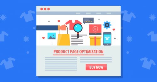
One of the best ways of doing this is to optimize all Navigation issues at the online store.
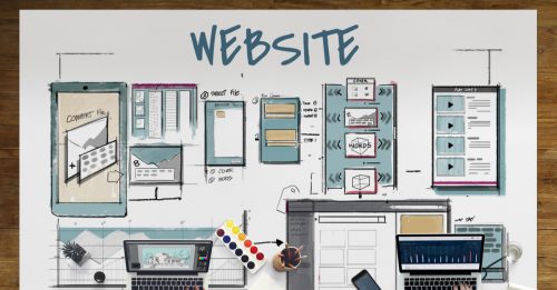
What is Navigation?
In the world of ecommerce, Navigation is the way to move around the web-store. In the absence of shop assistants and directional signage (as in the brick and mortar store) at the online store, easy navigation is the foundation of any website that can make or break it.

The ease of Navigation around your website basically determines how easily the visitor can move from one point at the website to another. This often plays a big role in how the visitors interact with the offerings at your website. The smoother the navigation experience, the more time the visitors will spend browsing around your web -store.
While simple, logical and intuitive navigation tools can help users find whatever they are looking for easily and make shopping at the website smooth and enjoyable, the opposite can be frustrating and disappointing – a sure way to drive away those visitors forever!
Planning For Smooth Navigation
This doesn’t happen by chance.
You need a good deal of planning of the website architecture, design and even testing to enable smooth movement through the store.
When planning, think from the perspective of the visitor. What are the natural leads that make the next click worth it? Does brief product information become more detailed? Are shipping terms detailed with product information? Are store policies listed on a separate page clearly? A well organized and optimized navigation system will not only allow visitors looking for products or information to find them easily, but also enable them to seamlessly move from one page to another.
And unless this is properly done, no matter how good your product or content, the users will not be able to find it!
Positive customer experiences are a prerequisite for them to stay longer at the store, explore your offerings, engage with your content, convert to customers and hopefully become brand loyalists over time.
Areas to look out for
Website Design

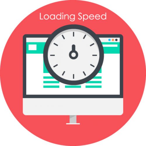
One of the challenges is to hold the customer’s attention and for this, a fast loading site with an exciting and professional design is necessary to create that good first impression. It is also important to be consistent with the style, look and tone of the content throughout the website. This reduces ambiguity and chances of confusion apart from giving confidence to the user of the site.
The customer’s experience at exploring and moving around the website will largely determine his length of stay at the site. Longer the stay and greater the engagement, higher the chances of closing the deal!
Simple Classification
People prefer structure, simplicity, clarity and the familiar efficiency of a website rather than having to figure out an unconventional and complicated territory. It is desirable to have clear headings and descriptions to ensure that the visitor does not get lost and waste time and can reach his destination at the click of a few buttons.
So sticking to conventions by keeping the all-important headings in the Menu like “About Us”, “Contact Us”, “Our Products/ Services”, “Promotions/ Sale” or “New Arrivals” at the familiar Top Left or Right hand corner is a good idea.
Such classification basically helps break down the information available into smaller and more accessible and understandable blocks that can help save the visitor precious time in accessing the information that he is looking for.
It’s all about customer experience and what better way to impress and delight your users than enabling them to explore and engage with your website in an easy, intuitive and uncomplicated manner.
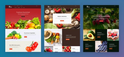
Product Categorisation
Planning and designing the appropriate navigation system of your website would depend to a large extent on the kinds of goods and services that you offer. How to organize them, what all should be logically grouped together, is there a way to filter them according to the buyer’s preferences?
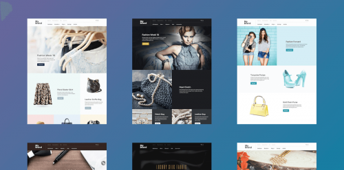
The best way out would be to put yourself in the shoes of the customer and visualize how you would ideally like to explore the site. Attention spans are short and no one likes to search through heaps of information to find what they are looking for- so creating sub categories might be another way of helping the user to access the product/ information easily.
The Search Function
Having a well functioning search button is a great navigation tool and an absolute necessity for visitors who want to go directly to their destination. They are usually the ones who have already made up their mind and are most likely to buy and you don’t want to waste their time and lose them.
Once that is done, the site can always throw up other interesting suggestions that might be of interest to the shopper.
Seamless Navigation
Customers are looking for a seamless navigation experience with easy access to whatever they are looking for- be it the product features or customer service or delivery and payment options, even the location of their office and their operating hours.
This can be achieved by efficiently interlinking all pages of the website and ensuring that the movement between them is fast and easy. Also, ensuring that all pages of the website are linked/ connected to the homepage help in movement and add to the user experience.
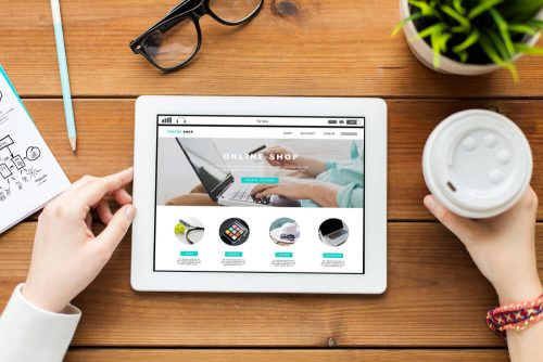
Mobile Ready
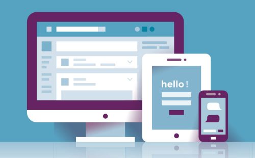
With more and more people shopping from their mobile phones and tablets, it has become imperative to ensure that every bit of your website (with the same structure/ features) is available and as easily navigable and responsive on the mobile phone as it would be on a desktop. Customers have come to expect it, as it makes it easier for them to shop on the go on their preferred devices. Such optimisation across devices and browsers also helps in improving the website’s SEO rankings and visibility.

So pay attention to the ease of navigation on your web-store; and if you need to make some tweaks to improve it, do that. Now is the time.
You could also have a look at the following blogs
https://blog.goshopmatic.com/optimize-your-conversion-funnel-to-increase-sales/
https://blog.goshopmatic.com/your-about-us-page-is-super-important-heres-how-to-get-it-right/
Get free online marketing tips and resources delivered directly to your inbox.
