You must cast your spell!
If you are a furnishing or furniture store, you surely know how important it is to be aesthetically appealing. The inspiration, ideas, layout and colors of your store are powerful charms that attract customers and window shoppers alike.
It is this very same magic spell that persuades visitors to become buyers, and the very same spell that you want to cast on customers and window shoppers who visit your online store too, don’t you? And you can.
Buying a sofa, a dining table or even a carpet for a living room has always been one of those experiences where buyers look, touch and feel before deciding. In the absence of such a tactile sensory experience, the importance of the visual aspect of the products displayed at your website gains special significance.
Online furniture and furnishing stores need to pay special attention to visual merchandising of their product range. Read on to understand more on the subject.
What is Visual Merchandising?
Simply put, it is the way in which stores present or display their items to make them visually attractive and desirable to the customer.

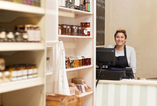
In physical furniture stores, shop floors are used to display items in a way that encourages customers to get design inspiration, move closer, touch, sit and entices the customer into making a purchase. The use of the right mix of color, lighting and aesthetic decor sets the mood and character of the display.
In the case of online visual merchandising, without the support of the other tactile experiences, there needs to be special emphasis on the use of visual elements. The objective though still remains the same – to enhance the customer’s experience at your store with the ultimate objective of motivating the customer to make a purchase.
Build an attractive shop front or homepage

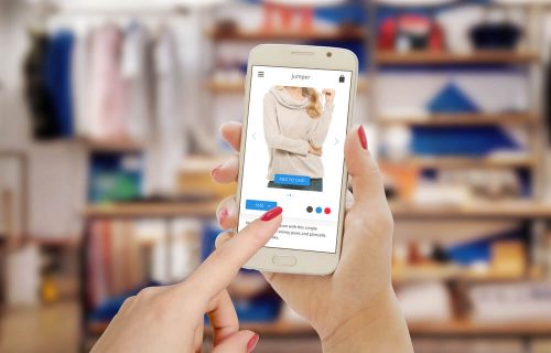
For the online store, the homepage is the shop front and this needs to be designed attractively, and look attractive on mobile as well. A choice of clean fresh colours, eye-catching and intuitive display themes are still as important as in a physical store. The quality and aesthetic appeal of the images placed in your website also have special significance.
Take full advantage of being an online store and rather than pay for an expensive shop front, provide alternative themes like Modern, Asian, Country style, Vintage, Minimalistic, or more. And include images that show your products displayed in creative or unusual ways too.
Add ideas for layout of small spaces, and how your products can fit these spaces. Customers really appreciate ideas and inspiration from furnishing and furniture stores!
Keep their interest alive by changing content regularly, just as you would in a physical store or if you were advertising your storefront.
For the visual display to be really effective, it is important to have good knowledge of your target customer profile and their budget, lifestyle and pain points. That way you can develop relatable layouts using your products and offer real solutions that are attractive to them. Take advantage of data gathered on your dashboard or through Google analytics to understand your customer even better as you go along.
Pay close attention to good image quality and product descriptions

What does a good quality image mean for online furnishing and furniture stores?
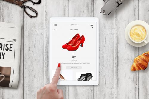
Firstly – take product images from different angles to allow the customer to zoom in and out of the photograph. This can help replicate the act of taking a closer look at the item of their choice.
Secondly, ensure you upload high resolution photos for all your products. And keep color schemes in mind even when you lay out the homepage.
Thirdly, and very importantly, highlight product details and its benefits comprehensively at the website. Color options, details of fabric and stitching patterns etc will give the customer a better idea about the product that they are looking into. Detailed product description and dimensions are known to facilitate quick decision making, and help conversions on your store.
Plan out a well organized store

This certainly applies to online stores!
Get inside a planner’s mind to organise your online store efficiently.
Think of your landing page as your showcase, and your product categories and product pages are the shelves. Just stocking up on good products is not enough. Customers are looking at well categorized and organised displays.
Have filters for each product category according to price or popularity or even size. This also provides a good opportunity to highlight categories like deals for the month or items on sale that can work for the customer.
Leverage technology to offer an enhanced experience on your store

There are tools available in the market like augmented reality or 3D technology that can be very helpful in online visual merchandising especially for segments like furniture and furnishing stores. 3 Dimensional digital renderings give customers the option to get close to the products and explore them in detail while augmented reality and virtual reality tools can allow them to see how those products would look in their own environment.
Imagine being able to see how a blue sofa would look in your living space and complement the rest of the furniture. Wouldn’t that help make an immediate connection and take you closer to making a buying decision?
At the same time, this also provides the store a good opportunity to make some suggestions of related products and complementary items like a coffee table or some interesting cushions that would be a good match for the sofa that they have been considering.
A Few Other Aspects to Note
Good customer support or a live chat support can assist visitors at the site by answering product related questions that the customer might have. These features offered on a platform like Shopmatic are very effective in helping decision making and closing sales.
Do create a cohesive brand image so that customers can recognize and notice you in a crowded online space. Have an engaging blog that you update regularly, offer live workshops with tips over social media and include a section on your online store that highlights customer reviews and your press mentions if any. All this helps enhance customer confidence, engagement and retention. This is absolutely necessary in building up a solid customer base.
Cast your magic spell!
With the closures/ restricted operations and movement as a result of the pandemic, many brick and mortar stores have had to diversify lately. A number of them have now adopted the omnichannel strategy and are going online to complement their physical outlets.
And even though customers are increasingly more comfortable and even prefer to shop online, shopping at a webstore is expected to be a fulfilling experience. One that is able to replace the experience of not touching, feeling and seeing the product in person.
To that end, make use of technology and strong visual merchandising that includes stylish layouts, well thought out themes as well as professionally taken images to showcase your products at your online store.
So go ahead, pay attention to design, cast your spell and charm your customers into making a purchase!


